DISCOVERY & BRAND VISION
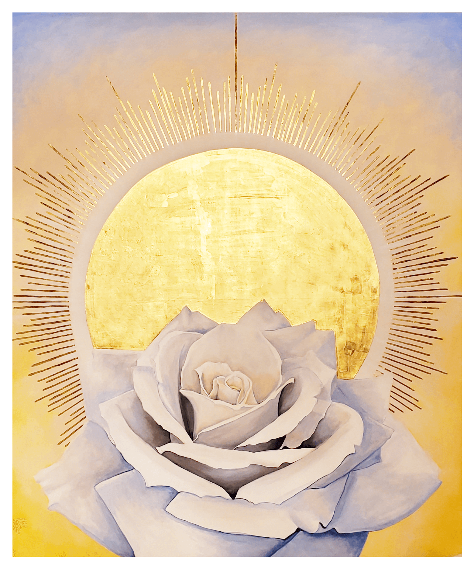
During our envisioning process, two key elements emerged as central to her brand: her background in Zen meditation and the textures and colors of her Iranian heritage. These deeply personal aspects informed the new direction of her brand. She wanted the visual identity to embody both gentleness and strength, qualities essential to her work in trauma healing.
DESIGN & SYMBOLISM
To achieve this, we used imagery of water and stone, evoking a sense of groundedness and fluidity, along with custom brushstroke graphics throughout the site. These elements symbolized both the resilience and the transformative power inherent in the therapeutic process.
For the logo, we chose the image of a swan, a symbol of the human spirit that is both in the world and beyond it—a powerful metaphor for transformation and healing. The swan’s grace and strength captured the essence of her work with complex trauma, making it the perfect icon for her brand.
RESULTS AND IMPACT
The end result was a cohesive and professional web presence that not only reflected the client’s new direction but also elevated her brand as a leader in training trauma therapists. The new logo, custom graphics, and polished design gave her the foundation she needed to confidently step into this new phase of her business, resonating deeply with her audience.
“My mailing list has grown exponentially with the exact clients and students who would benefit from what and how I teach. Visitors can navigate through my website pages with ease and find what they need.
One of the most invaluable aspects of the process was Yohanna’s creative and intuitive feel for what I wanted and her abilty to ask the right questions to guide me towards clarifying my goals. Yohanna is a joy to work with and I can’t recommend her services highly enough!”
~S.L. Embodied Resilience
www.embodiedresilience.com